- Published on
Thesis Thursday 2
- Authors
- Name
Over the past week I made a few detours and explored other options that yielded little. On the positive side, I managed to merge and clean most of the datasets and started generating some descriptive statistics to get a better understanding of the data.
Migration to the U.S.
Let us take a look at U.S. migration patterns from 1970 to 2012.1 I use the share of foreign born as surveyed in the decennial census and American Community Survey as a proxy for migration trends.2 Here are the geographical regions which experienced the largest increase in foreign-born share (%) over this period:
| Place of Birth | 1970 | 2012 | Difference | |
|---|---|---|---|---|
| 1 | Central America | 0.50 | 4.83 | 4.33 |
| 2 | Caribbean | 0.34 | 1.26 | 0.91 |
| 3 | India | 0.03 | 0.82 | 0.79 |
| 4 | South America | 0.14 | 0.91 | 0.77 |
| 5 | China | 0.10 | 0.74 | 0.64 |
| 6 | Philippines | 0.10 | 0.63 | 0.52 |
The bottom 6 regions are tabled below:
| Place of Birth | 1970 | 2012 | Difference | |
|---|---|---|---|---|
| 19 | Eastern Europe | 0.87 | 0.74 | -0.14 |
| 20 | Germany | 0.53 | 0.39 | -0.14 |
| 21 | Uk Ireland | 0.52 | 0.32 | -0.20 |
| 22 | North America | 0.52 | 0.32 | -0.20 |
| 23 | Italy | 0.52 | 0.14 | -0.38 |
| 24 | Local | 94.15 | 85.64 | -8.51 |
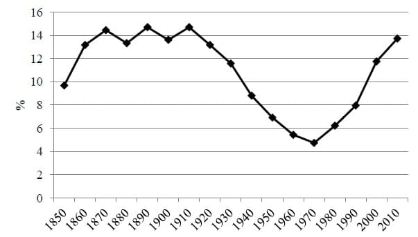
There is some ambiguity over the choice of geographical aggregation which might affect the relative ordering but the underlying point can be seen quite clearly from the tables. The share of individuals born in the U.S. or from other European countries declined as individuals from Latin America and Asia migrated over. In fact this period captures the rebound in foreign born share as shown in the following graph, taken from Abramitzky and Boustan (2016)3, which plots foreign-born share through the years:
The geographical dispersion of migrants is also worth a closer look. Here is a plot comparing the share of foreign-born in 1970 and 2012:
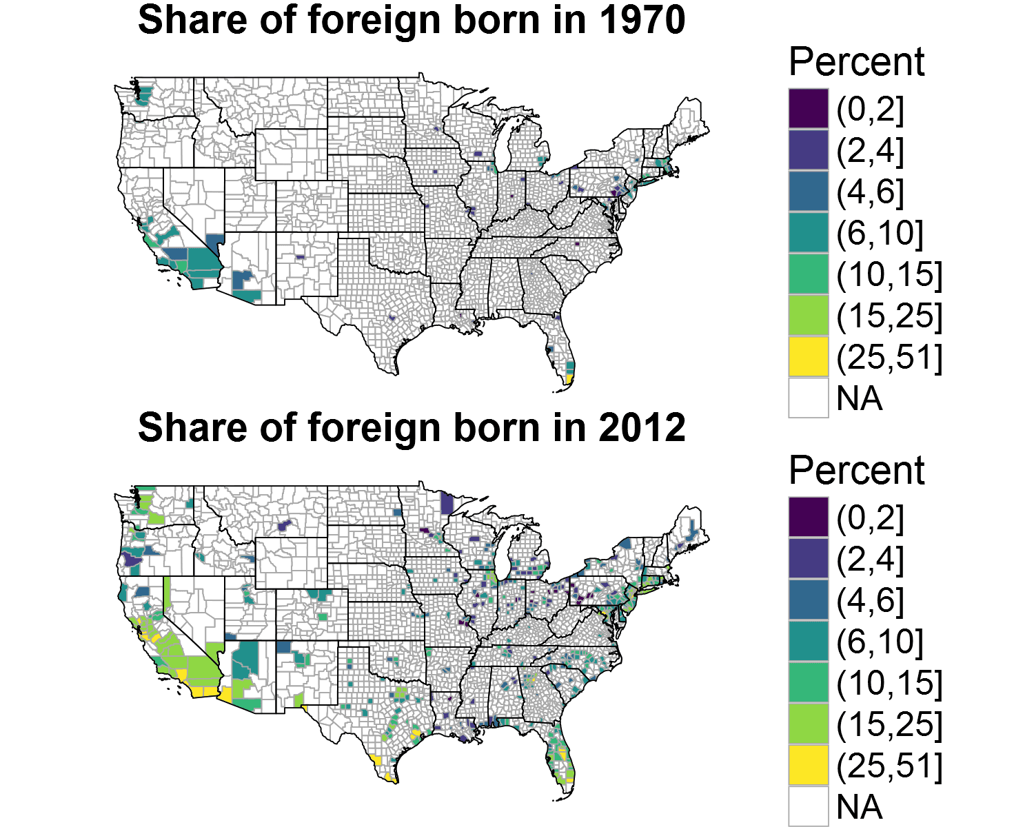
The numerous missing values is due to data being censored if the population in the statistical unit being sampled falls below a certain size. Not surprisingly, a significant fraction of the population is concentrated along the cost and these are also the places with high foreign-born share. From 1970 to 2012, the fraction of foreign-born has increased almost across all regions.4
Let us also take a look at the variation in settlement pattern by country of origin. Here I compare India against China in 2012:
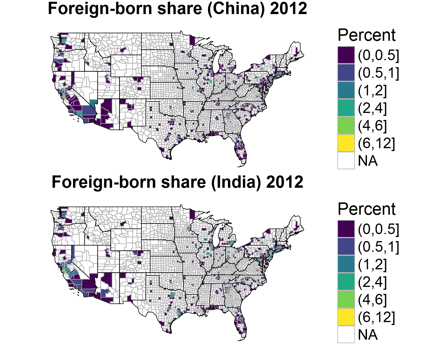
It seems like there is a strong correlation between the migration patterns though maybe a scatterplot would be a better way to visualise the similarities or differences.
Data issues
I still have not solve the tricky issue of mapping consumption data to immigration flows. After cleaning the consumer panel data I was a disappointed by the level of detail it contains on fresh produce. While it has extensive documentation on brand data, the actual nature of the product is also not exactly clear (e.g. oriental noodles). I gave the idea of using restaurant data further consideration but eventually decided against it as I do not think the question is of economic interest.5
In the end I have gone back to the consumer panel data and would be trying to work at a broad "oriental" level for these few days. This also means putting aside the recipe data for now though on the plus side this actually simplifies the analysis. Nonetheless, I still aim to explore heterogeneity but would have to take a closer look at the dataset to come up with a feasible idea.
To-do list
- Download and clean ipums data
- Scrape recipe data
- Clean consumer panel data
- Flesh out the model in greater detail
- Settle on the right level of aggregation across the datasets
- Think about the relationship between recipe, purchases, migration (always doing so...)
- Merge all the datasets and analyse the data at a broader level
- See if there is some way to break down oriental products
Additional thoughts
The borders on the geographical plots are really ugly and I should get rid of it (10/6 - done).
Footnotes
2012 data is from the 3 year ACS 1% sample. ↩
The list of countries are not consistent across the survey so aggregation is required to generate a consistent set of data for comparison. ↩
The paper provides a nice historical review on the the two eras of U.S. migration, the Age of Mass Migration from Europe (1850-1920) and the recent immigration flow documented above. ↩
Each polygon corresponds to a fips code, which is used to identify states and counties in the U.S. ↩
Sure, one would expect a correlation but what does that mean? Without data on consumer spending, it would be hard to identify what causes the correlation which is the more interesting question. ↩